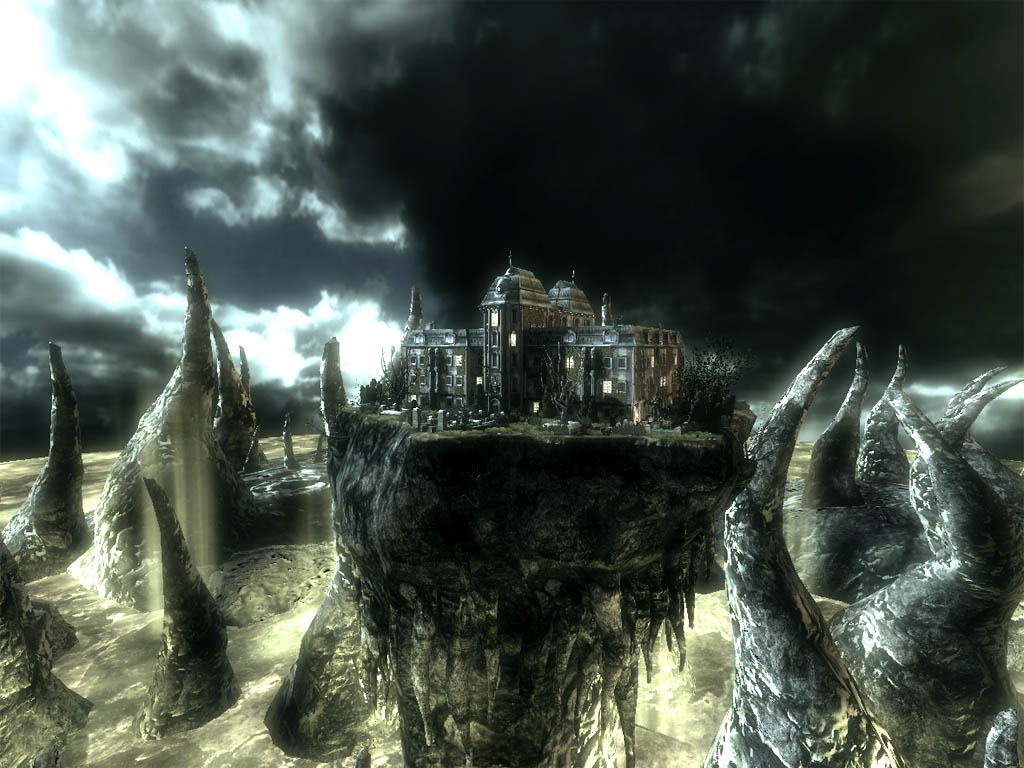
So I was thinking about the style and feel of our game. Thinking about demons, hell, and things of the sort I automatically picture violent red colors. However, I'm not sure if that's the direction we should take. I came across this picture on Hourences site and thought something like this may fit our game perfectly.
http://www.hourences.com/portfolio/work/new3/gowspire1.jpg
Subscribe to:
Post Comments (Atom)
You sir have read my mind! Damn you're good!
ReplyDeleteI've been studying a variety of tryptyc art displays. Bosch and other artists. Landscapes following the Turner style are probably just what we are looking for. They have a really creepy natural feeling. Something that red and orange just doesn't offer. I like the theme that "Hell is/looks real." It looks like a stormy day; something that is already part of our natural perception. Anywho...I'll post some pics later.
ReplyDelete